
KAT SEALE - ART DIRECTOR
*
KAT SEALE - ART DIRECTOR *
Design Portfolio
2019-2025

Special K
2022
Acrylic on Paper
Who is Kat?

I am currently studying at the University of Denver in Emergent Digital Practices and minoring in Marketing. Emergent Digital Practices combine art and new technology, including AI.
I am looking for opportunities as an art director in advertising and branding.
Be Kind
•
Be Confident
•
Be Creative
•
Be Kind • Be Confident • Be Creative •
PROJECTS
Advertising and Creative Strategy Class Projects | 2026
Thinking Visually Assignment
Brief: Use these photos to create ads for a real company with a headline and tagline.
My Role: Student Art Director, Designer, & Copywriter
My Process:
I wanted to exercise my creativity while staying true to each brand. For each ad, I picked the brand first based on each photo and practiced concepting before writing the copy and designing in Canva.
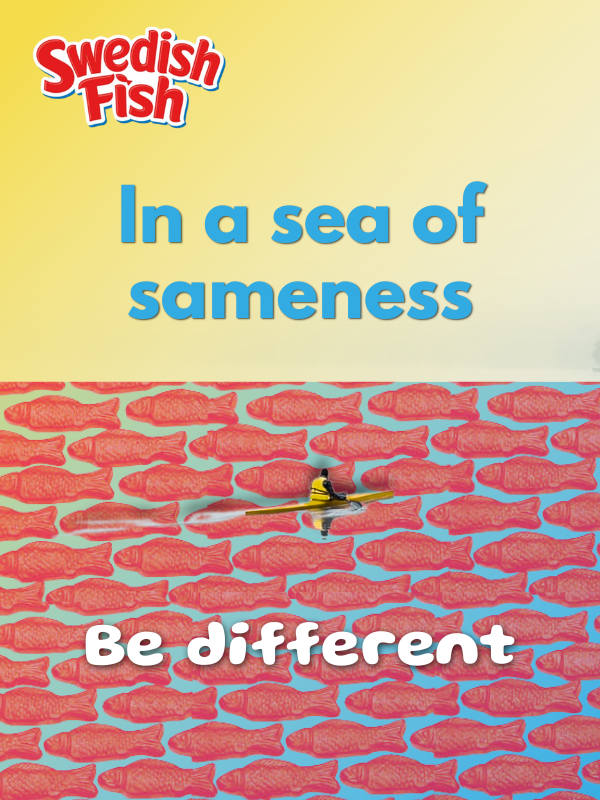
Swedish Fish Mock Ad
With this ad, I drastically altered the colors and added extra graphics to reflect Swedish Fish’s colorful branding. I decided that, instead of an outdoors brand or travel brand, the original photo could work well conceptually with the fun brand identity of Swedish Fish. I used photos of Swedish Fish to create an exaggerated sea filled with the candy. Behind the fish, I added blue from the brand colors for recognition and to enhance the coloring of the original photo. With the person in the photo going the opposite direction of the fish, I decided to create a headline and tagline that reference Swedish Fish’s singular product standing out from competitors. I used a fun font for “Be different” to stand out from the rest of the ad. The copy is meant to evoke the want for individuality and the aspiration of being a trendsetter.
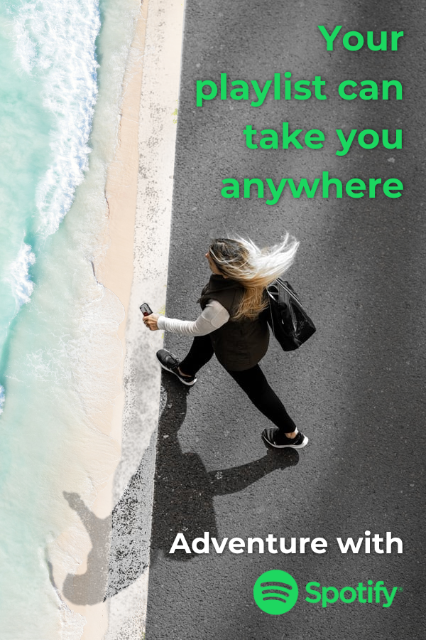
Spotify Mock Ad
For this ad, I followed the concept of being transported by music. I integrated a beach visual to offset the city landscape and exaggerate the contrast between different locations. The headline evokes greed and resonates with the emotional and transformational power of music. The tagline “Adventure with Spotify” reinforces this idea and focuses on emotions rather than tangible benefits or features. I used Spotify’s brand colors and font to create consistency. In a possible campaign, this idea could be reiterated with different destinations and song lyrics connecting to those places to resonate with different segments within the target audience.
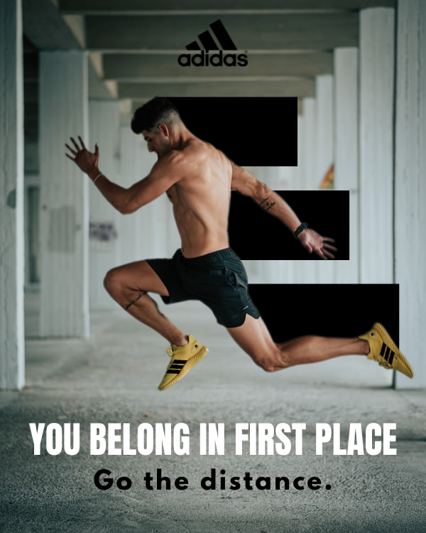
Adidas Mock Ad
I decided to use the Adidas logo to represent speed and motion. I was inspired by cartoon and comic characters and their speed lines, which enhance the perception of motion. The lines in the logo were also created to simulate first, second, and third place. I included “FIRST PLACE” in the headline to connect to this subliminal message and idea. The headline is meant to appeal to the consumer’s aspirations. and the tagline is meant to enhance that idea and hint that Adidas shoes are built for durability and speed. I incorporated the Adidas logo at the top of the ad to give the audience motion and visual interest within the layout.
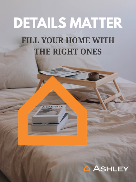
Ashley Home Furniture Mock Ad
The main idea behind this ad was to incorporate the logo to focus on snapshots of everyday life. By focusing on small details instead of the big picture, I wanted to evoke a feeling of comfort and the feeling of home. Visually, it made the most sense to encase the books with the logo to show the rest of the scene and leave enough room for the copy. The headline “DETAILS MATTER” is to let the audience know that the difference between their house becoming a home could be a few items from Ashley. The headline and tagline are also supposed to romanticize home decorating and renovation by focusing on tangible, beautiful items rather than on home furniture associated with labor.
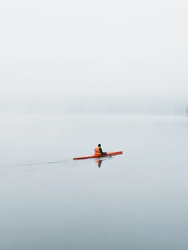
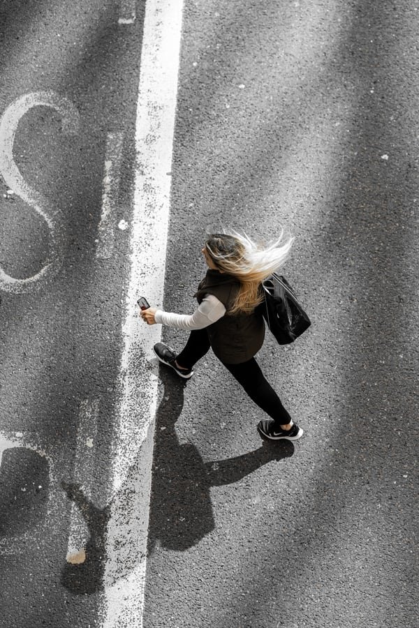
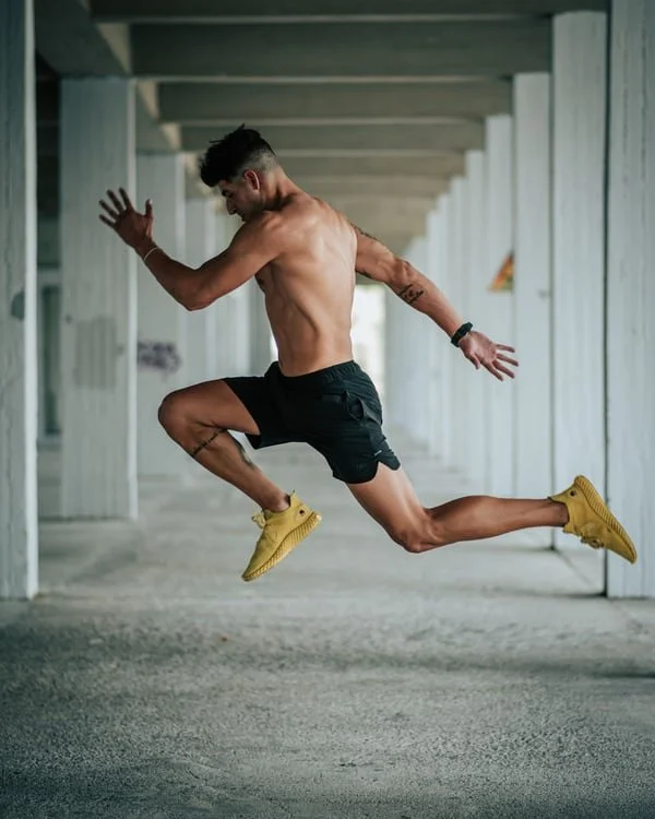
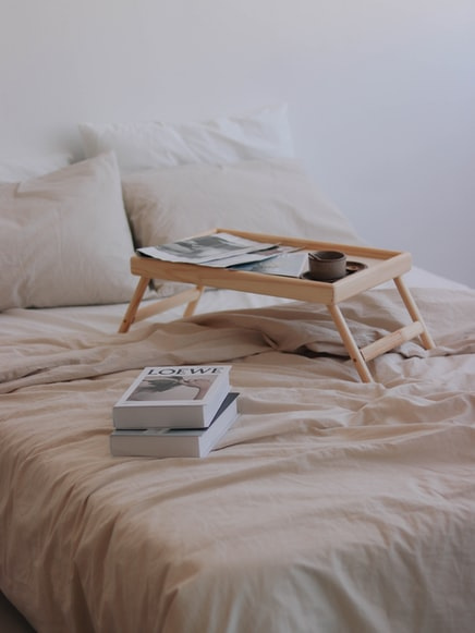
Original Photos:
Autside Bags & Boards Series Logos | 2024
Brief: Use the Autside logo to create specialized logos for each series of Bag & Boards products.
My Role: Logo Designer and Marketing Intern
My Process:
Using the pre-existing Autside branding, I wanted to create a unique but cohesive identity for each part of the series. I focused on communicating the practical applications associated with each series through recognizable icons. My main goal was to assemble simple yet visually interesting logos that clearly displayed the Autside logo.

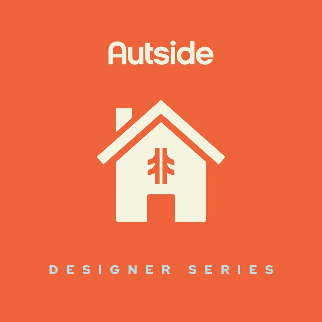
Designer Series Logo
This series was created to supply luxury Bags & Boards to homeowners who wanted to incorporate fun into their home design.
I used a classic home icon design and replaced the window with the Autside logo to connect Autside products to the home. In logo form, I wanted to communicate that a house is made into a home with the addition of family fun that comes with Autside’s Designer Series Bags & Boards.

Events Series Logo
This series was created to partner with event venues to create custom Bag & Boards for clients.
I used a ticket icon to connect to the tradition of using tickets to display event information. I replaced the event logo or information printed on the ticket with the Autside logo. By using the Autside logo, I intended to communicate that the Autside Event Series Bags & Boards are an essential addition to any event.

Weddings Series Logo
This series was created for happy couples to have wedding-specific Bags & Boards to commemorate their wedding day and provide fun for guests.
I used an interlocking wedding ring icon to clearly communicate the target audience. Instead of using lines to showcase the cut of the ring, I simplified the diamond and placed the Autside logo there. Placing the logo on the ring instead of inside the set of rings seemed to create a stronger connection between wedding iconography and the Autside Weddings Series Bags & Boards.

Tailgate Series Logo
This series was created for football fans to have Bags & Boards at Tailgate-specific events.
I used a football icon to attract football fans and replaced the football lacing with the Autside logo. I wanted to communicate that Autside’s Tailgate Series Bags & Boards are an integral part of the tailgate tradition, directly connecting Autside with football.
If I created this now:
I would rearrange the use of the Autside color scheme to better fit the application of each series.
Designer Series: I would keep the colors for this logo the same.
Events Series: I would make the Events Series background dark blue and keep the orange-red logo. I would swap the color of the “For Events” caption with cream for legibility and differentiation.
Wedding Series: I would make the Wedding Series logo dark blue with a light blue background, mimicking typical light color schemes of weddings with still enough contrast for legibility of the logo. I would use the darker green color for the “For Weddings” caption to create the association of outdoor weddings. This would also prevent the possible association with Christmas colors in the color scheme.
Tailgate Series: I would make the background of the Tailgate series logo dark green, with the cream color for the logo. I would use the orange-red for the “Tailgate Series” caption to differentiate the caption and the logo. I would eliminate the light green entirely, since it does not appear anywhere else in the series logos.
Brief: Personal project to re-design the Pacifica Beauty logo for better legibility and visibilty on Pacifica products.
My Role: Logo Designer
My Process:
I picked a brand identity that inspired me and tried to find a way to make it better. After looking at Pacific Beauty products, I realized that the logo font was too thin and did not stand out on every product. I decided to re-invent the logo by using a bolder font, brand colors, and brand values and imaging.
Pacifica Beauty Mock Logo | 2025

Pacifica Beauty Mock Logo Redesign
Using a bolder font than the original, I decided to choose a serif font that meshes well with the quality and elegance of Pacifica Beauty products. I originally made a colored version of the logo, and later created non-color-specific and simplified versions that could be used on different colors of packaging. I used the original crescent moon motif with the C’s, making them a similar width to the font. The plain logo after still seemed too forgettable, so after researching the meaning behind Pacifica’s name, I included a wave motif that followed the cross-sections of the A’s and F in “Pacifica.” I also wanted to re-inforce Pacifca as a beauty brand for young adults. Because of this, I used a round sans-serif font to emphasize the elegant playfulness and whimsy on the packaging.

Pacifica Beauty Mock Logo Redesign | Purple
I simplified the logo and wave motif to create a singular color logo option. On some packaging and brand items, Pacifica Beauty includes the tagline “100% Vegan • Cruelty Free.” I mimicked the original design by using a similar all-caps sans-serif font different from “beauty.”

Pacifica Beauty Mock Logo Redesign | Simplified Blue
Next, I made a simplified version of the logo and decided to use a line that separated the colors in the original mock logo to show the wave. I found this was the most effective way to include the motif and visual interest without hindering the legibility of the font. I experimented with an outlined version of “beauty” as well, but ultimately decided it was not visible enough.
If I created this now
I would move the “y” in “beauty” farther from the rest of the word to create more even spacing along with the second “A” in “PACIFICA.” The spacing overall could be adjusted, with farther spacing between “IFI” in “PACIFICA” to break up the concentrated area.
Brief: Create a mock campaign by scouting locations, photographing group members, and incorporating “SCAD,” Coca-Cola products, SCAD and Coca-Cola logos, the Perfect Together tagline, and the Coca-Cola ribbon.
My Role: Model, Location Scout, and Adobe Photoshop Editor
My Process:
My seminar group members and I scouted vibrant locations with the intention of highlighting Coca-Cola products and creating messaging of joy and connection between SCAD students and Coca-Cola. We positioned the products to show the product logo in each photo.
SCAD X Coca-Cola Perfect Together Mock Campaign | 2022
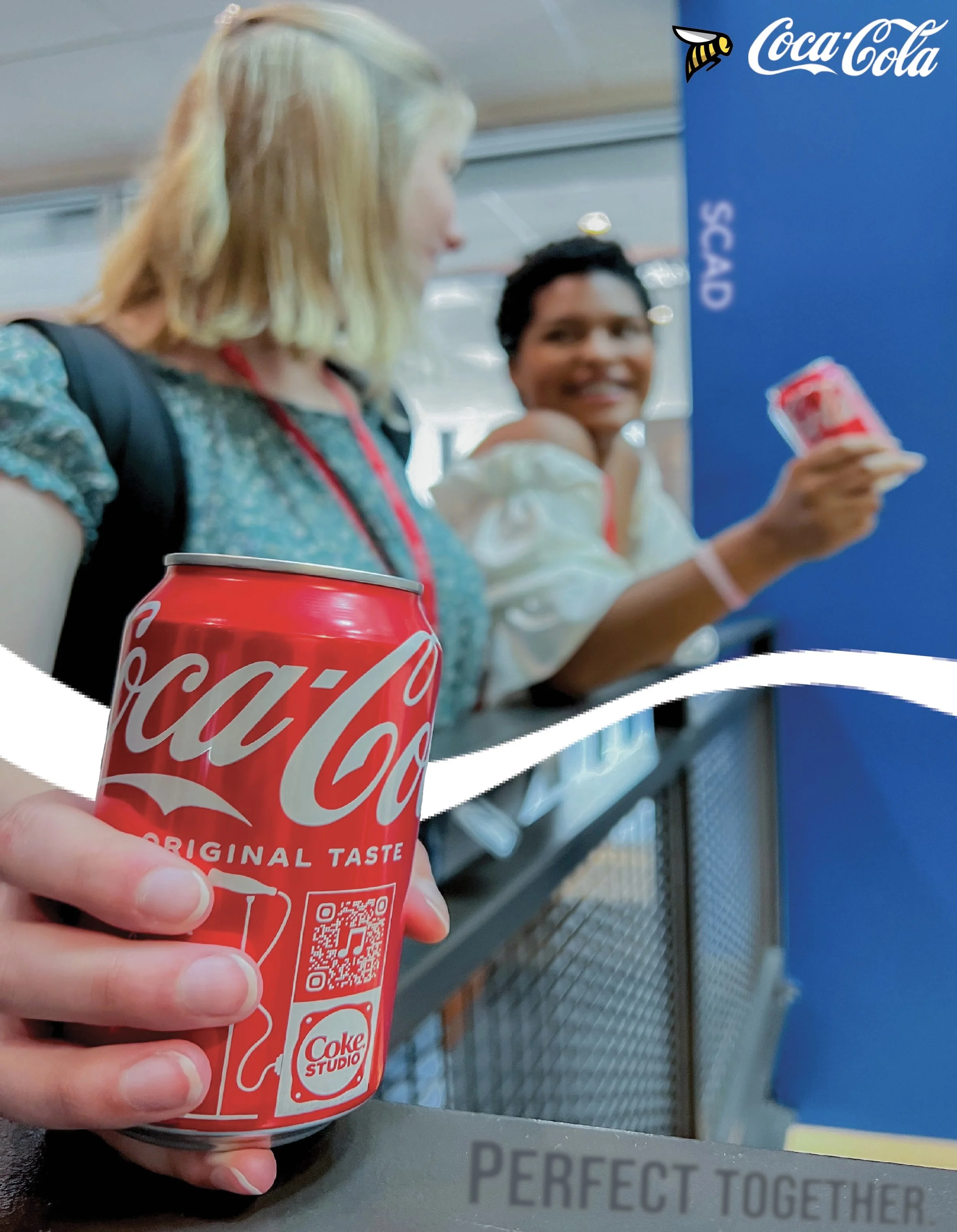
Photo #1
This photo was the most successful within the mock campaign.
My group and I positioned the models to have a more natural feel. We also focused the photograph on the can to highlight the product and make the photo seem less staged. A problem I came across was that the out-of-focus photo made “SCAD” on the student lanyards illegible. I solved this by adding SCAD to the wall in post-production, trying to make “SCAD” legible yet matching the blurred background to seem as though it was an original part of the building. We also chose the location with the blue wall to create contrast with the Coca-Cola can. Using that contrast, I placed the SCAD and Coca-Cola logos in the top right corner to make them pop and fill the empty space. We intentionally added the railing to place the Perfect Together tagline near the focus of the photo. I wanted the tagline to feel like an organic piece of the photo by making the text darker and blending it with the railing. I placed the ribbon behind the product to place additional focus on the can and simultaneously connect the foreground and background.
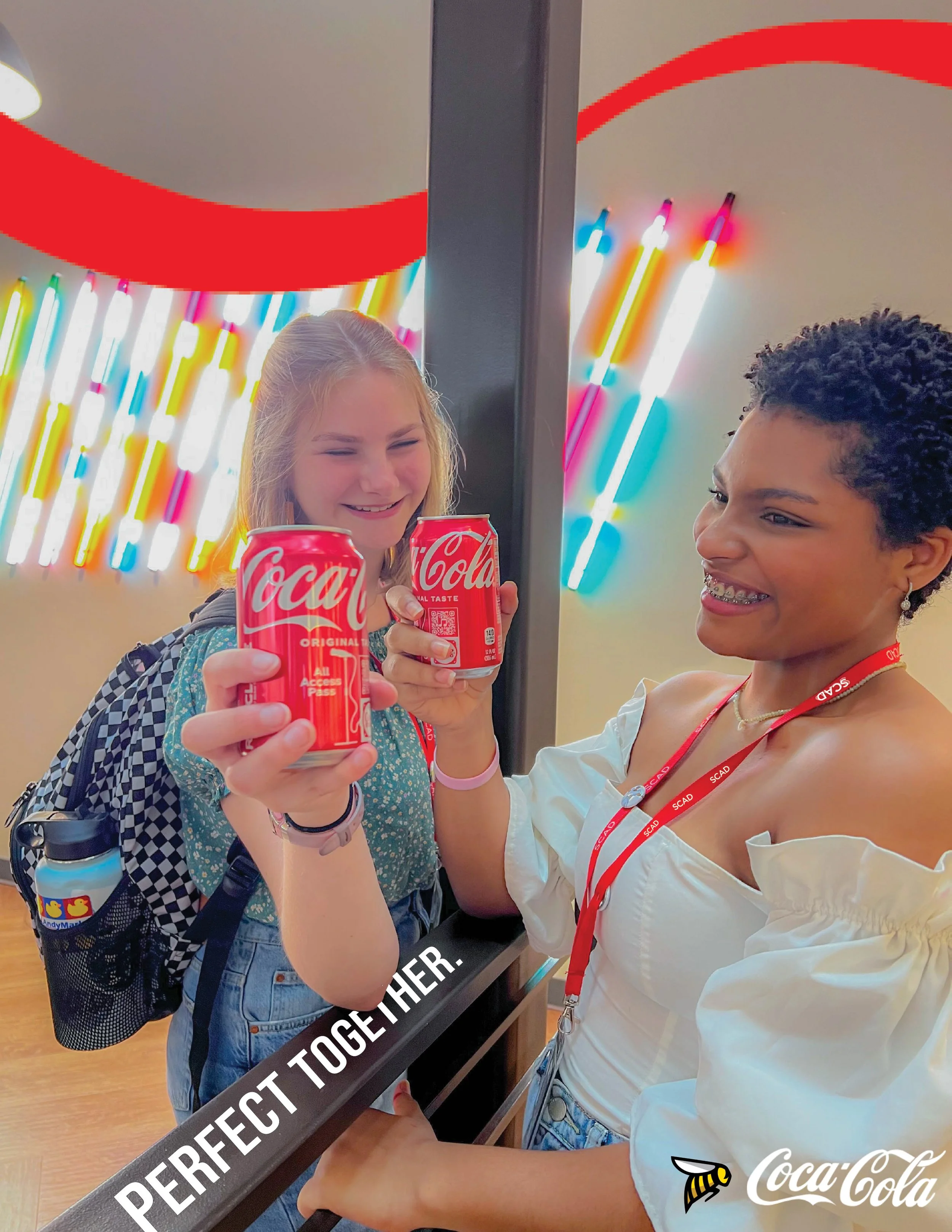
Photo #2
My group and I chose this location because of its vibrancy to accentuate the color of the product. Similar to Photo #1, we chose a place with a railing for model positioning and to place the tagline. We wanted to position the models in a semi-interlocking position that would not obstruct the view of the product and show connection. This positioning was created to replicate a “cheers” moment. The lanyard was placed for “SCAD” to be visible and legible. I edited the tagline and ribbon to interact with the location architecture and reinforce the connection motif. The ribbon was positioned above the models to frame the moment and prevent obstructing the view of the tagline. The SCAD and Coca-Cola logos were placed in the bottom right so they would not overlap with the tagline and ribbon. I used a shadow to prevent the logos from blending into the model’s white shirt.

Photo #3
We chose this location due to its vibrance and red chairs, which complemented the red Coca-Cola can. I decided to diversify the products by using Diet Coke to offset the inorganic model positioning. We positioned the models in an overlapping placement to show the space, models, and products in the frame, and to emphasize connection. I edited the ribbon to interact with the models and product. The tagline was placed on a background wall to continue the idea of elements interacting with SCAD architecture and offset the text on the right. The SCAD and Coca-Cola logos were placed in the bottom right corner near the product to create visual movement. We positioned the lanyard to make “SCAD” visible.
If I created this now:
I would alter the brightness, color, and tagline placement within the photos.
Photo #1: I would enhance by making the tagline a bit darker to make it stand out from the railing.
Photo #2: I would reduce the brightness of the photo and lower the exposure of the background artwork to readjust the focus. While “SCAD” is visible, it is not noticeable. Similar to in Photo #1, I would add “SCAD” to the right side of the pole and blend it to make it seem like a part of the pre-existing architecture. I would also slightly change the color of the tagline to match the Coca-Cola logo and make it match the coloring of the rest of the photo.
Photo #3: I would lower the brightness of the background lighting slightly. I would also either crop out some of the left side of the photo, or re-position the models to re-distribute elements in the foreground and background. This would also allow me to move the tagline into a more visible place like the pole. To offset the tagline, I would position the logos in the bottom left corner. I would finally place the ribbon behind the model’s lanyard and add “SCAD” on the wall on the left near the lights to make it more visible and follow the SCAD architecture theme.